The Legend of Zelda: Twilight Princess HD is one of the most notable releases in the first half of this year, bringing the GameCube / Wii title into the high-definition era with some amiibo support thrown in. It should provide a decent start to the year's 30th Anniversary celebrations for the franchise.
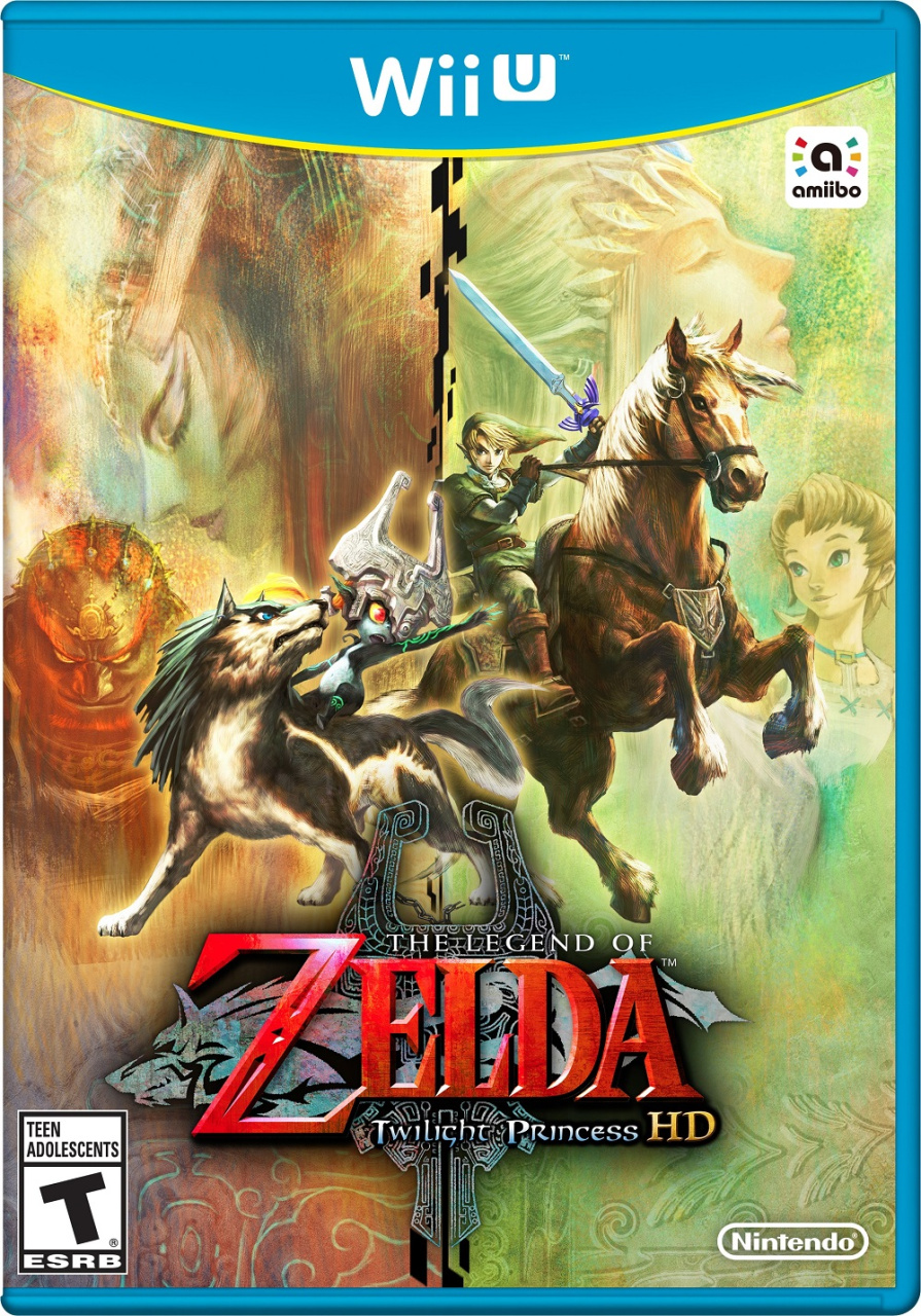
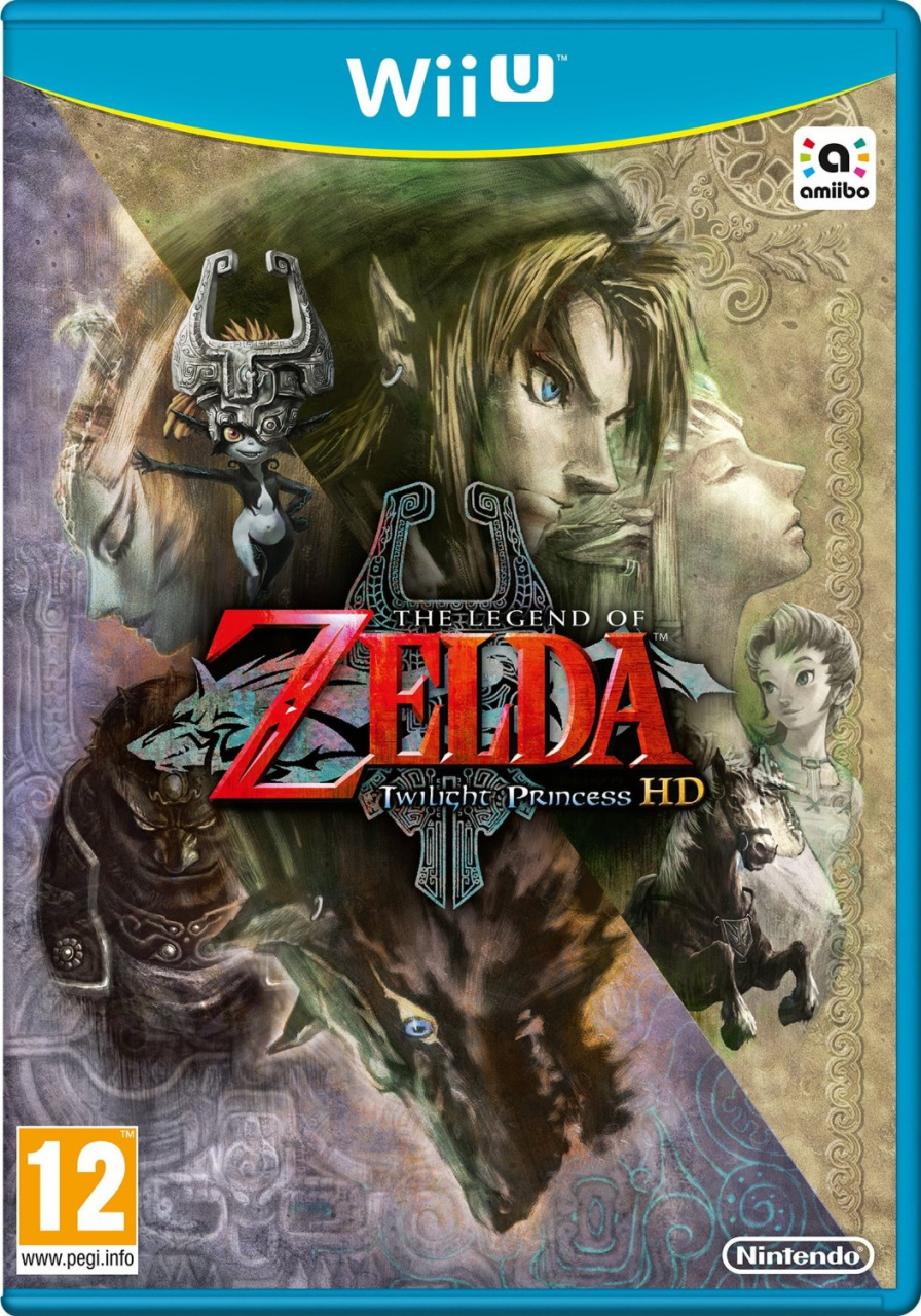
Though boxart for the amiibo bundle edition has been kicking around for some time, now the actual disc art has popped up online. The European art is following the lead of the Japanese equivalent, while in North America there's a brighter design, which reminds us a little of Skyward Sword. Check them out below.
North America
Europe
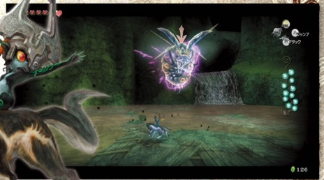
Famitsu has also run a feature on the game that, ultimately, brought very little new detail. The only snippet of something new that's been picked up is a suggestion in the screen below that the Lake Hylia area has less Tears of Light to collect - there are 15 at the equivalent point in the GameCube / Wii original, but only 11 on Wii U.
This writer will be perfectly happy having less to collect in these sections, but it's all about opinions.
Are you starting to feel the hype for Twilight Princess HD?
[source perfectly-nintendo.com, via perfectly-nintendo.com]

Comments 114
Just hoping for a facelift and some somewhat smoother textures... Upgraded music couldn't hurt either.
Kind of hard to say which one I like more, but I think I'm leaning more towards the NA boxart.
@MrPuzzlez I feel the same way. The trailer didn't seem to enough of an improvement visual wise to me. But there's been a few months between the announcement and game's launch so you never know.
As for box art, unfortunately as I'm in Europe, I kinda feel it's nowhere near as good as that of North America.
Oh God, yes. I hated those tears of light portions, I hope they fixed that up this time around.
That game is absolutely fantastic. I want more of it please. I'm not much a completionist myself but I'd gladly jump into this again, and do everything again. (I still feel sorry for myself not having completed the treasure hunt on Wind Waker.)
For people who haven't played the game yet, the boxart spoils Midna's true form. Way to go, Nintendo.
For people who haven't played [or finished] the game yet, I'm going to explain a spoiler that people might not have caught. Way to go,@abbyhitter
fewer Tears of Light*
I personally liked the first two tears of Light sections, but the Lake Hylia one was way too hard; so I'm glad to see they've fixed that.
I enjoyed the tears of light sections. I really liked the pacing of this game right up until the city in the sky dungeon.
@abbyhitter You mean for those who hadn't already played/heard of Hyrule Warriors? Besides, I'm pretty sure the promotional artwork for the original game did the same thing, but you can't recognize Midna's true form as being such, really, unless you've played the game before.
I'm not digging the European box art. They took a clean, intriguing image and cluttered it up with a bunch of characters, making it feel like a teen's attempt to make something cool in photoshop.
The North American box art isn't much better but it does relegate the added characters to a background layer with nice separation from the foreground elements giving it a slightly cleaner look.
I still wish they had just gone with an original art piece for the cover.
@abbyhitter aaaand the fact that the true villain is Ganondorf.
@abbyhitter Like @Haiassai and @allav866 said, unless you've beaten the game you wouldn't even see that. I didn't even notice it until you pointed it out. Besides, it's not like everyone doesn't already know what her true form looks like. Just search "Midna" on the internet and you'll see plenty of plot-spoiling pictures.
@Calllack You're right. It's kind of odd that Zant isn't even on there. He looks a lot cooler anyways (well, with his mask on I mean).
EU boxart is easily better than the US art. I wish I could have that one.
The NA box art is gorgeous.
Why are they changing stuff like that but not the graphics? Priorities people!
Unrelated, but look what's coming tomorrow in NA:
http://www.nintendo.com/games/detail/metroid-zero-mission-wii-u
I strongly prefer the North American cover in this case. If the European one is similar to Japan's, this time I'm afraid they screwed up on the original cover, as far as I'm concerned.
As for the tears of light, I never had any problem with those sections. Not sure what the ruckus is about.
The only snippet of something new that's been picked up is a suggestion in the screen below that the Lake Hylia area has less Tears of Light to collect, with 15 in the GameCube / Wii original but the Wii U only feature 11.
If you look at the picture more closely, Link has 11 Tears of Light, and is fighting the giant twilit bug for the final one in Lanayru Province, making it 12 altogether. You can even see he has room for one more tear.
The NA boxart is better, but both are pretty.
Well I for one actually really like the European boxart, and prefer it to the American one. That's just me though.
Also, why is Ilia on the front but not Zant? Ilia always seemed like such a random boring non-character in the game to me. Even Colin would've been better - but I guess it's due to the franchise's obsession with waifus in recent years.
I prefer the EU boxart but both are great, a shame about the amiibo logo though.
@CB85 I think Zant should've been on the boxart instead of Ganondorf.
For once I'm happy to be a Nintendo fan in NA, that box is gorgeous.
But does it have Wiimote controls?
@abbyhitter And just who would those people be? Twilight Princess is one of the highest-selling Zelda games ever made, mostly thanks to the Wii version. Most of the people that have wanted to play the game already have.
Still my all time favorite Zelda with SS coming in at a close second soI'll definitely be picking this one up. Also glad to see Nintendo still supporting motion controls (I felt they were superior for Twilight Princess anyways). Hopefully they'll be included for swordplay when Wii U zelda finally hits.
@IceClimbers !!!!!!!!!!!
Unfortunately, people will still complain. I'm talking about Zero Mission. It's nice that it's finally here, though!
@abbyhitter Well, I think other users have done the job of detailing the flaw in your comment, so I don't need to say anything much.
And those box arts are quite good, IMO. Though Midna looks off on the EU version... it almost looks like she was a last-minute edit to the box art. shrugs
@GraveLordXD Not quite, anyone who has paid any attention to the Hyrule Warriors DLC will have been spoiled just like those who play the Majora's Mask DLC will be spoiled for the respective game due to the masked trials.
@Turbo857 Where was motion controls confirmed?
If you need me I'll be playing Link's Awakening.
Loved this game, but I'm not paying for a quick cash in. Nintendo's been TOO desperate for money these days.
@abbyhitter but if they haven't played the game yet, how would they know that's her true form? Or that she even has any other form at all?
Way to go, abbyhitter.
Maybe just delete the post. shifty eyes
So glad I didn't buy TP a few months ago! I haven't played it yet or Skyward Sword, but I'll pick up that one after I play TP. I know it's supposed to be darker than most Zelda games, so I'm looking forward to that--although I was surprised to be won over by wind waker hd--I loved how colorful and cute it was especially little Link; such a badass.
@Mahe Unless that person would have got his Wii + all games, DS Lite + all game and all PS3 games stolen right when he wanted to get up to date. And then lost any interest in gaming before buying a Wii U again. That person might also be an amiibo collector who will jump on this occasion to have a great amiibo plus the game he always wanted to play.
<---------------------------------- Maybe that person has this profile picture too.
Hoping the game will have Hero Mode, since this game was considered to be too easy.
@Grumblevolcano
I saw it in a few places but it's confirmed here: https://www.pixeldynamo.com/news/gaming/2015/11/25/88937/motion-controllers-confirmed-twilight-princess-hd/
One of the few times where the American cover is the one I prefer. XD But isn't it a spoiler to have Ganondorf on there. I know, the game is 10 years old, people already know about him being in it but it's still something that isn't revealed until the midway point.
Hype? No but I am still gonna play it and preordered the Amiibo Bundle last month. Also our (Europe) boxart is way better.
"bringing the GameCube / Wii title into the high-definition era
Is it bringing both versions into HD - with and without motion and both right and left handed Link? Game is out soon, would be nice if they told us which version, or both, is getting the HD treatment.
yes, amazing. Going to buy a golden frame and hang it on the roof right above my bed so I can look at it when it is pitch dark, hoping it will never come falling down and kill my as I sleep.
@Vee_Flames Well of course. Perhaps next week we'll get Super Mario 64 DS or Wave Race 64 (or Mega Man Battle Network 6, which Europe is getting this week), assuming NoA continues their streak. Of course, that's a bold assumption.
That being said, the complaining will of course move to Super Mario RPG.
*kill me
I was fine with the Tears of Light. What this game really needs is a higher difficulty, more agressive enemies, and better rewards for the sidequests.
North American box art, simply for the brighter colors and more "bloomy" lighting effect! 😃. Plus the characters are more spread out, which I like! 👍
@abbyhitter No, they added a character to the box art that will be completely unfamiliar to people who haven't played the game. You, on the other hand, did just spoil it though.
I must admit, I was pleasantly surprised when I first played this game on the wii! I thought the wolf transformation was strange but it felt just the same as traversing the light/dark world in LttP, which meant it flowed well and felt somewhat natural, despite its preternatural substance. It was also refreshing and felt completely original.
@abbyhitter hey abby, psst, it's the little dude on the bottom right next to the horse right?
I prefer the Euro box art. Everything is always so typically bright with N box art and the darker tone fits the game better. Less Tears of Light? Thank God. An unwelcome piece of filler. I honestly can't wait to canoe down the river again. It was my favorite part. I went down that river a million times. Bring on the NX btw, I'm ready
Sorry but, no 60fps no sale. Already played through it recently on Dolphin.
I like the box art we are getting in the UK/Europe!
Why did people have a problem with the tear bits? I liked them, kinda like a break from the main game in a way
@Haiassai @abbyhitter
That's not even the biggest spoiler on the box. Zant in you-know-who's place would have been much better.
@daniruy I'm a hugh fan of Twilight Princess too. Am wondering what the amiibo unlocks will ger you too. By the way I didn't complete the Wind Waker treasure hunt until the HD version came out - the swift sail makes it a lot better.
@burninmylight @abbyhitter
I think there were more spoilers in this thread than on the box art (though the Zant in you-know-who definitely caught my eye......)
The one thing europe always seems to do better is box art, resident evil 4 being a good example. I mean north america some how has an emphasis on showing off the main character usually with a grimace, kirby is a good example of that.
@ThomasBW84 I think you mean 12 tears instead of 16 and not 11 instead of 15.
@IceClimbers OHMAGAWD, YES YES, AND FREAKIN YESSSSSSSSSS!!!!! I lost my hard copy of the game so I'm DEFINITELY getting that one!!
@abbyhitter Technically, the box art itself didn't spoil it, but your comment kinda did. But it's highly unlikely they didn't already see her true form in Hyrule Warriors, which is what spoiled it for me. Similarly, Melee/Brawl spoiled Sheik's identity for me as well. The only time I wasn't spoiled was in Wind Waker, when you find out tha—
@Turbo857 I wouldn't mind it. At least I could play it for more than 3 hours, GamePad! >_> Either way, options are ALWAYS nice for the consumer.
I can't decide which box art I prefer... Gah, they're both so dang good!! >_<
The NA cover looks good, but I think the Europe version matches the original better, so I prefer it.
I didn't mind the tears of light in TP, but if they ever do an HD remake of Skyward Sword, I surely will love it if they either reduce the number of light things to collect in the dark stealth levels, or remove the arbitrarily unnecessary time limit in them. Can't re-play SS just because of how much those sections frustrated me.
I prefer the NA box art (which is the version I'll be getting). Midna is out of place in the UK version. Also, if the tear changes are like the triforce changes in WWHD, I'm happy that they are there.
Do we have to use Wii motes to play? Does it support the Wii U pro controller?
I see a lot of people pointing out the Midna thing, so I figured I'd put my 2 cents in. Nintendo stops caring about spoilers after about 2 or 3 years from release at this point. Otherwise Lucina wouldn't be in Smash or PXZ 2, Mecha Fiora wouldn't be in PXZ either, Midna wouldn't have her human form in Hyrule Warriors, etc. So if you want to play a game spoiler free, your best bet is to play in the 1st year or 2 from here on.
"Fewer"
So from this box art I am to assume Nintendo of America still insists on going out of their way to advertise themselves as a company that makes light hearted, kid friendly games?
I mean, Twilight Princess isn't a bright colorful adventure like Wind Waker, you're just falsely representing the game in the name of upholding an image at this point.
I love the dungeons in the game. My favorite was the sky temple
Holy cripes! I just realized this game is ten years old this year. And the Wii system too. I feel way too old.
The amiibo logo kinda ruins it a bit imo.. I like NA's box art more though.
The sword's in his left hand!!!!!! Now I can sleep at night .
I'm loving the NA box art, the European one seems to cluttered. It takes the original box art and adds too much. Anyways I'll probably pick this up eventually, not in a hurry since I still have Twilight Princess for the Wii and still need to get Wind Waker HD.
@Turbo857 Never trust random articles. Nintendo's Swedish site has since then removed the Wiimote and Nunchuck as compatible controls. It was just a mistake.
The American cover isn't ugly, but I prefer the European cover. Oh well, maybe next time....If I get the game, I'll get the standard edition. Really depends on how the game looks on release, the trailer didn't convince me.
I like both forms of box art, though I prefer the North American version a bit more. The tears of light sections never really bothered me, but I won't complain if there are less to collect.
I just hope that the remake gets some version of hero mode.
@ElkinFencer10
THANK YOU. This drives me batty heh heh
I rather like the new one, but the old was cool too.
I never realized the cover art was so spoilery, sporting Ganondorf instead of Zant!
I like both covers,but I like the EU more just cause I like the dark look of it
Wow that NA boxart is stunning!! Also collecting tears of light in this game wasn't particularly challenging or difficult, Skyward Sword on the other hand... :S *shudders
@abbyhitter lol pretty tough to avoid that spoiler for 10 years seeing how she has a trophy in Smash, is playable in Hyrule Warriors, and the Internet exists.
I'm feeling the hype so much, I may break down and buy the amiibo bundle, and I don't even know what the amiibo does in-game! I just know it looks AMAZING! Hopefully it shall remain my first and only amiibo.
one of the few times that I prefer the NA box art. Can't wait! TP is one of my favorite Zeldas.
Neither are bad but they're definitely overly cluttered...
The europe one would look better without Midna just randomly floating there.
whoa!!! What a gorgeous cover!!! I would pre-order this just for the box art... is what I would say, if I hadn't already pre-ordered it!!
Can't wait!! Definitely the Wii U game I'm looking forward to the most.
Now I want buy this game just for the cover! (I love TP but I played too much)
Wait.... an american boxart thats better than the european version.... WHAT?
I prefer the European boxart, but I'd prefer that more effort was made to improve the remaster itself.
I'm glad about the Goddess tear bit. The boxart looks nice but I'm only getting physical to keep on my shelf with that sweet amiibo, but I'll play it digitally.
Both box art is good. You know what they say, the grass is always greener on the other side.
NA box art looks fantaaaastic.
Also I can't believe we have people complaining about spoilers... for a ten year old game.
It's weird that Zant has no presence in the box art at all yet Ganondorf, who is in it for 10 minutes, gets on the box.
Also, it seems I'm the only one that liked the Goddess Tears part. It's an adventure game. You have to go out and do stuff.
Anything to trim the filler is a step in the right direction in my book.
Wait, wasn't the NA box art revealed in the trailer earlier? The only new news is the EU box art.
Never played it, and cant wait to
Bonus dungeons. Bonus dungeons. Bonus dungeons. More. More. More. Less poes to hunt though please... And a way to control day and night. And not too much nerfing. Maybe... Ok I'll stop. Lol.
Almost forgot about this one. preordered it once it was announced and that was it... Excited to relive the moments but xenoblade has my FULL attention at the moment 😁
This might be my last retail game on the Wii U.
Definitely prefer the European box art
Never played Twilight Princess... the shame
@abbyhitter @Calllack
The box art doesn't really reveal anything. Midna looks nothing like her true form so its not exactly obvious who she is, just that she has a big role, and anybody who's familiar with Zelda would expect Ganondorf to be in the game somewhere even if they hadn't played Twilight Princess yet.
You guys on the other hand definitely spilled the beans.
The European boxart is too similar to the original one for me.
I actually didnt see a problem with the Tears of Light Mini-Missions. They got me involved in searching every little nook and cranny in the areas and it was very exciting to see the difference between the world I learned (bathed in Twilight) and the Light World differences (the color and vibrant scenery) when the area was rescued.
Additionally, the Tears mini-missions were a very small part of the game. The Triforce Hunt in WW was a large aspect of the game that dragged on much further than it should have and when combined with the Slow Sail it bacame overwhelming. Definitely something that should have (and was) improved in the HD. But these Tears? Nah. If anything, I would say they should speed up the intro a little, make it into the first temple about in half the time. And that would do. Add a Hero Mode and maybe another collect all the X and I think the game would be fine. Add in the amiibo interaction (even if it becomes the Collect all the X) and I am quite pleased with this mock-up I created in my head.
It took me a while, but I finally remembered the single part of the Tears mini-missions that bothered me.
@ThomasBW84 and @MitchVogel What do you think about the idea that the 4 missing Tears are actually just the Tears during the hard Flight Tunnel just being removed? I recall them as being the hardest Tears to collect and coincidentally there were exactly four in the tunnel...
Really not a fan of the European version, which I'll be getting unfortunately. The NA one is awesome though.
Both cover artworks look really great, but I do have to say that the North American looks a bit more cool.
@evosteevo That's right. However, I'm European and I prefer the European boxart because it's cleaner and more similar to the original one. Funnily, I might get the digital version, because that's how I got The Wind Waker HD. I'm concerned about the pricing, though. I don't want to pay €60 for a GameCube remaster with minimal improvements. That was the price of The Wind Waker HD but I got it for free when I bought Mario Kart 8.
@Octane
Any printed article on the net... is essentially a random article. And just because it was removed, doesn't necessarily mean it was there by mistake. They could've simply jumped the gun without proper clearance. I'm still keepin' my fingers crossed for motion controls.
@Turbo857 The site isn't managed by Nintendo themselves, but by Bergsala. If there was motion control in the game, we would've known by now. Don't count on it; This game is just a up-res'd version of the GameCube one.
@Zombie_Barioth my work here is done... heheh
Am I only one who thinks the europe box art is lot better....well I think so anyway, I like it's closer to the original box art with a darker tone fitting the darker tone of this awesome game.
Also I am hoping there is like a option to play the game Wii version style with everything mirrored from gamecube version and motion controls and no gamepad, or just the gamecube version style. I'd personally prefer the Wii version with the original Wii controls since it's the version I own and originally played and loved. I am sure everyone has their preference about the versions, so both versions should be must.
Also I don't like if they are cutting those tear sections and making the game easier, I actually kind of liked those sections.
I like that Zant is not shown on either box art. But you clearly get a look at Ganondorf, who was more of a behind the scenes villain until the end I thought.
I love the Eu box art more as it is closer to the original box art.
The US box art is way better. The Europe one is far too close to the original box art for my liking.
The box-art from America and Europe both spoil 2 very important characters, for the people who haven't played it before. By the way: I think I'll like the American box-art a bit better, the European-one is very busy.
Tap here to load 114 comments
Leave A Comment
Hold on there, you need to login to post a comment...